Personal Type Design
July Typeface
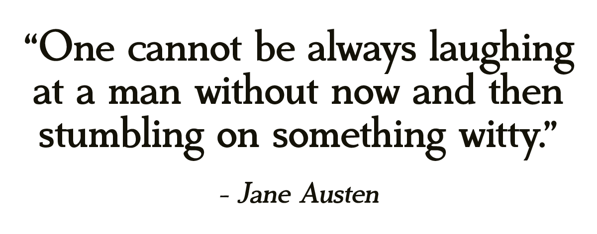
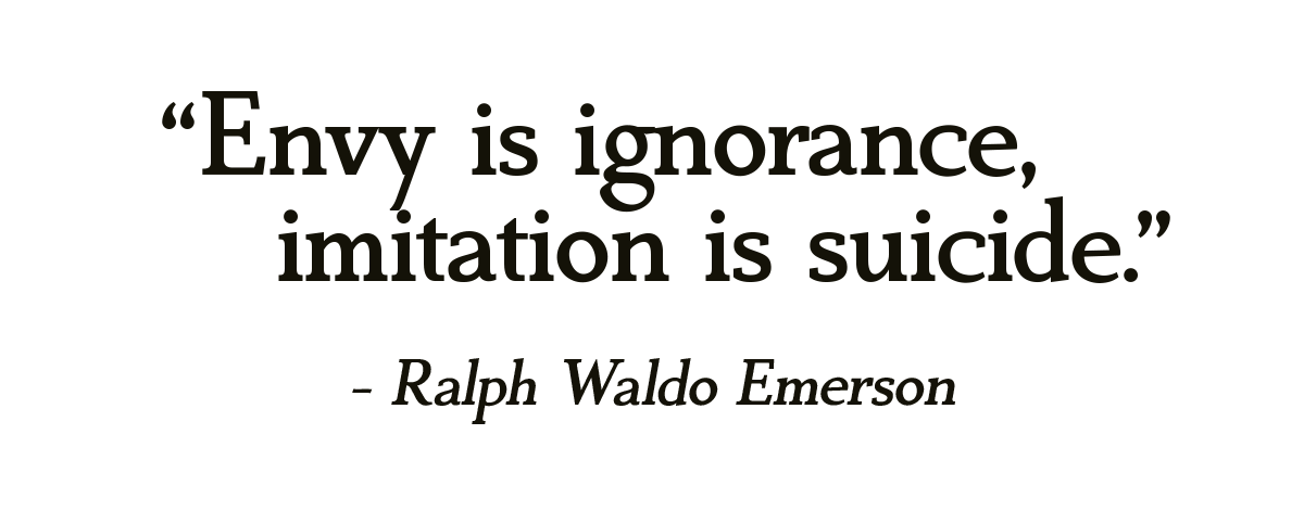
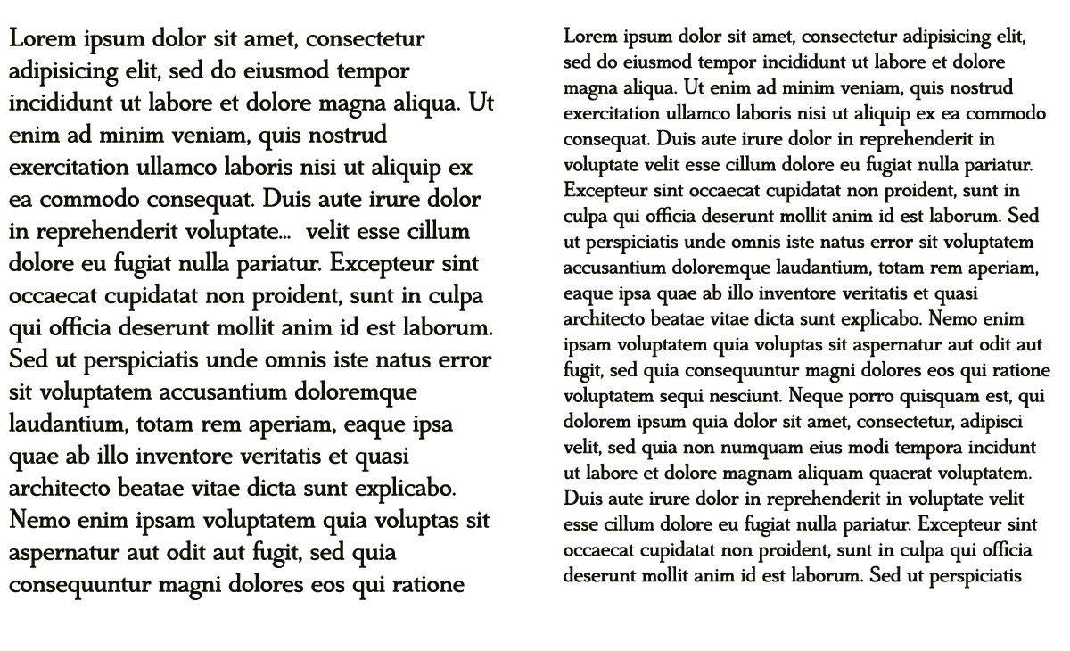
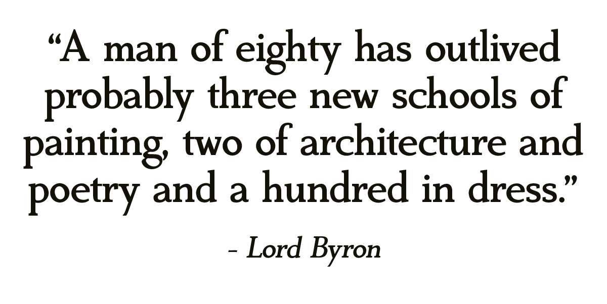
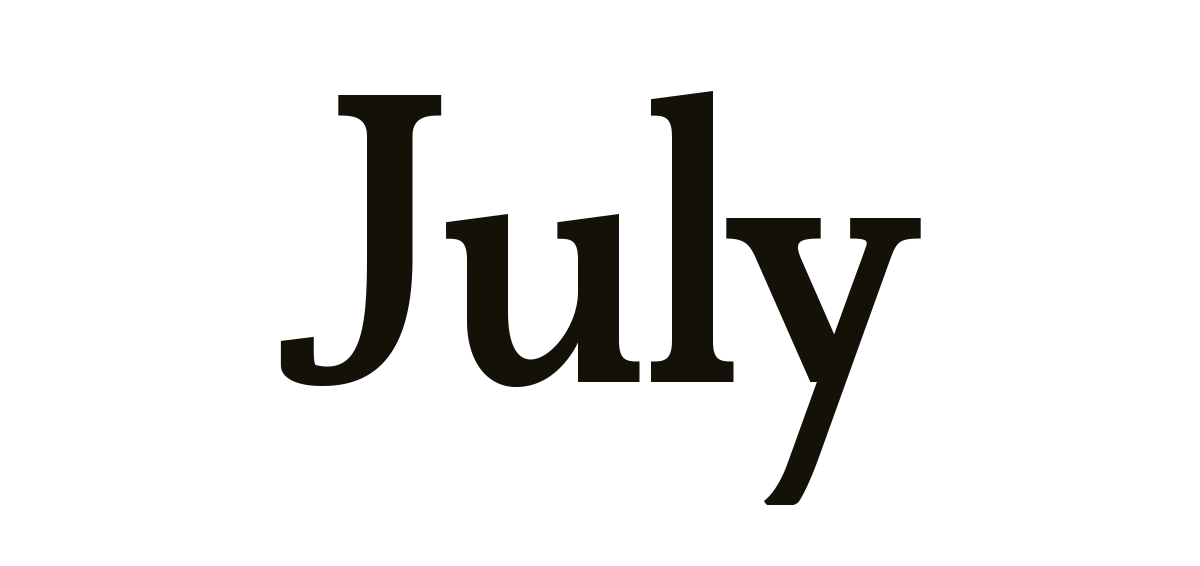
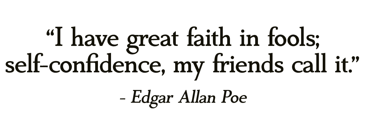
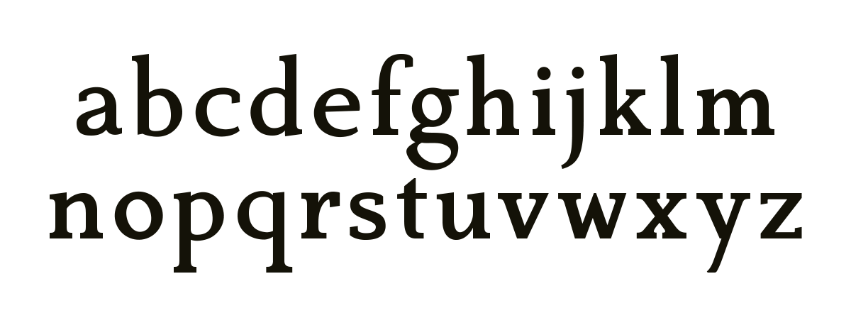
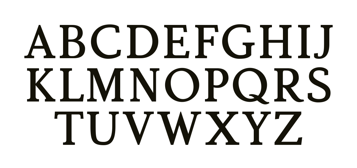
I've design July as a personal training project. It's visibly hand-crafter with dozens of small inconsistencies and tweaks in almost every character, which gives July a warm, friendly character, at the same time remaining pleasantly even in a block of text.


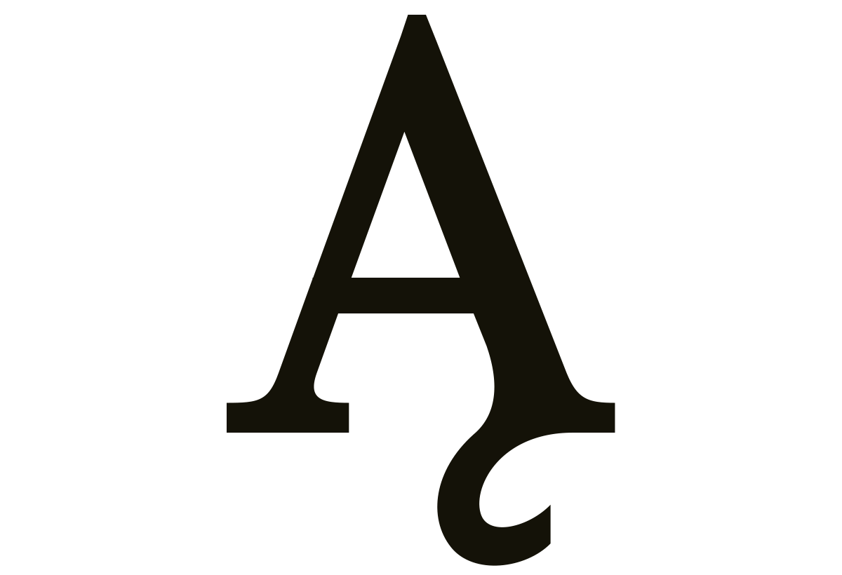
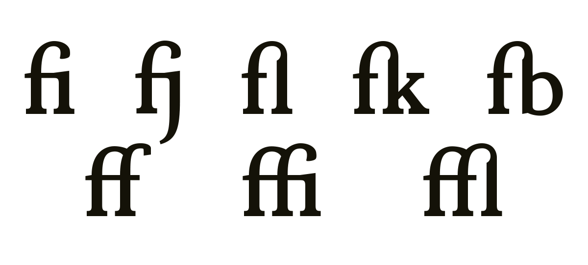
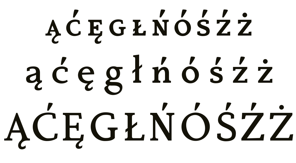
Special characters are not merely regular letter with additional elements attached. Diacritics are an integral parts of the letter, changing the way it's drawn.
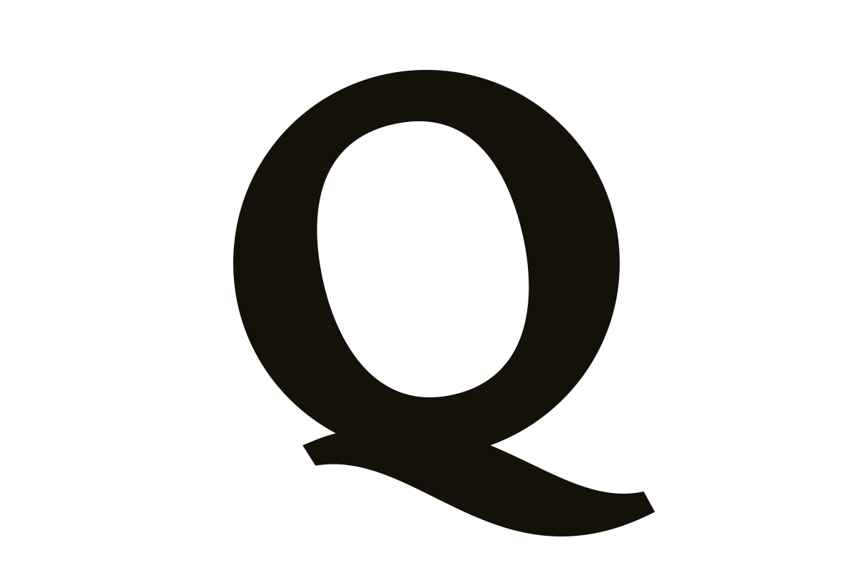
Small caps are not just scaled down capitals. Often they have their own versions of certain letters..
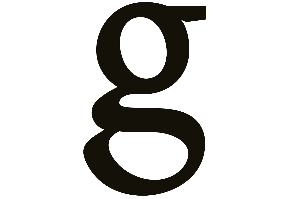
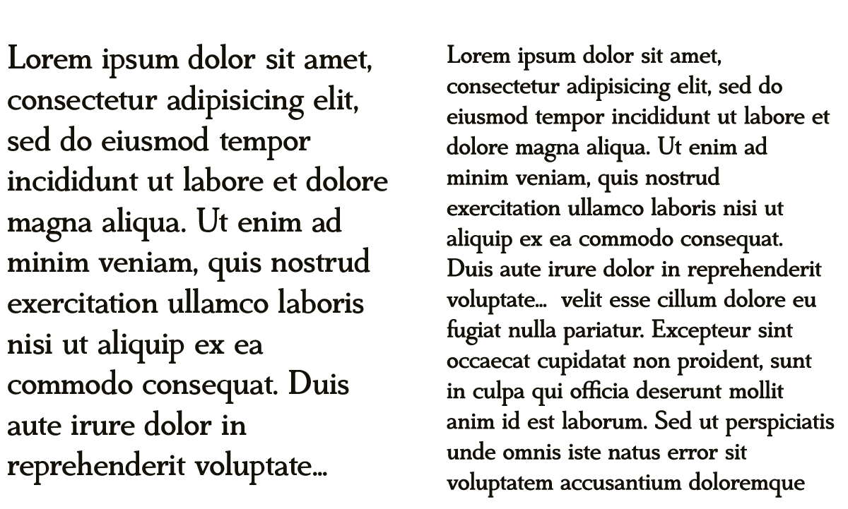
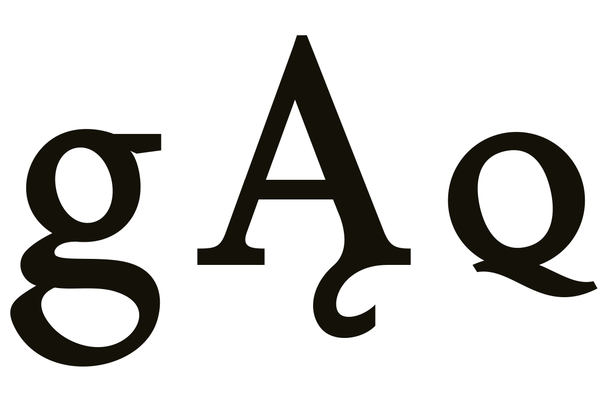
July even has inktraps (notice the small g's arm), which enable it to remain readable even in small size print.
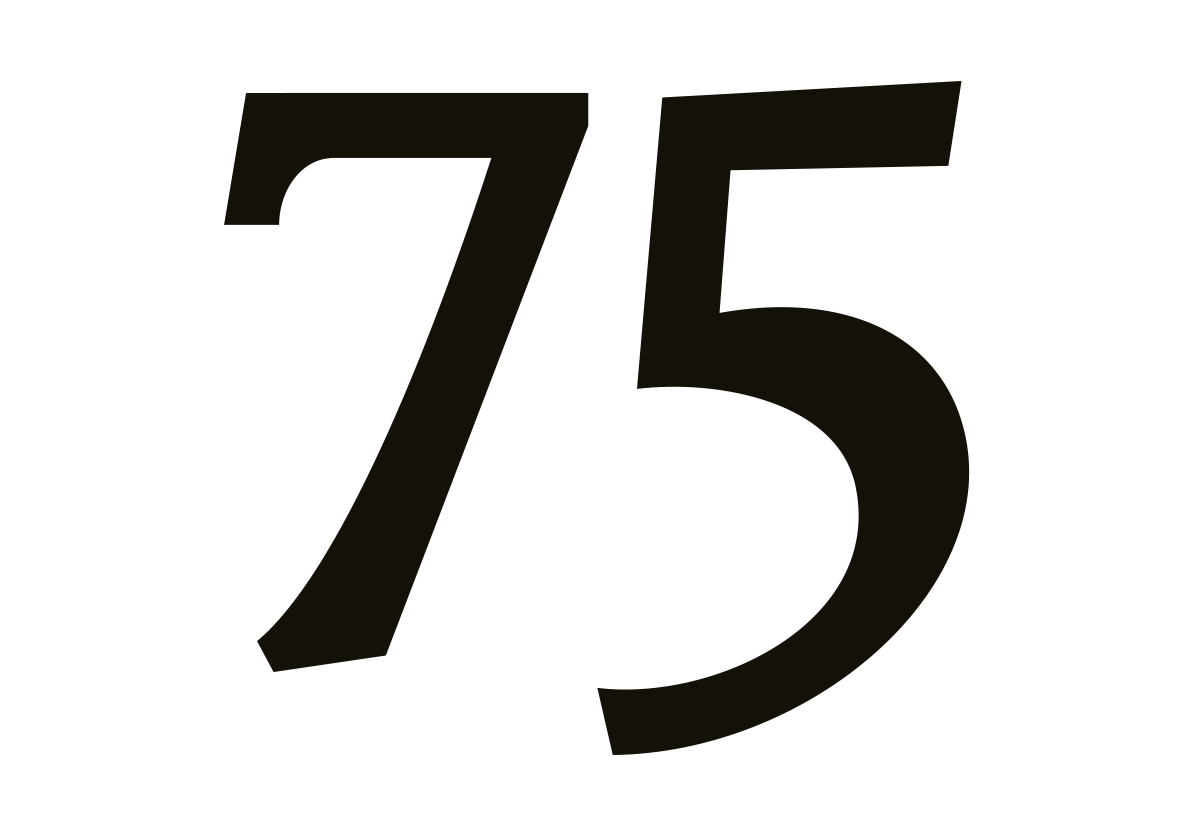
Old-style numerals draw attention to themselves with a unique hand-drawn styling and at the same time remain clearly readable.

